Did you know that more people now use mobile devices to visit blogs than desktops? With 63% of all internet traffic coming from mobile, making your blog mobile-friendly is essential. But is your content ready for the small screen?
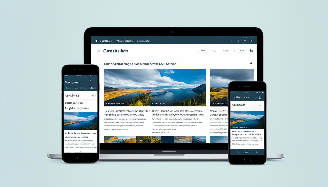
Responsive web design is the answer. It changes your content to fit any screen size or orientation. By optimizing for small screens, enhancing mobile user experience, and using mobile-friendly themes, you can grab and keep your audience’s attention. This way, they’ll enjoy your blog no matter how they view it.
Importance of Mobile-Friendly Blogs
In today’s world, having a mobile-friendly blog is key. Almost 84% of people worldwide own a smartphone. Mobile traffic has gone past desktop at over 54% of all web traffic. So, if a blog isn’t made for mobile, it could lose a lot of readers.
Mobile Traffic Surpasses Desktop Usage
Mobile traffic is now more than desktop, showing blogs must meet mobile user needs. A smooth mobile experience keeps readers around and lowers bounce rates. Sites that don’t work well on mobile often see high bounce rates as users look for easier-to-use content.
Poor User Experience Leads to High Bounce Rates
A bad mobile experience, like slow loading or hard navigation, can push readers away. These problems make users leave the blog for easier options. Making a blog mobile-friendly helps keep content accessible and engaging. This reduces bounce rates and keeps readers coming back.
In conclusion, mobile traffic’s rise and the need for a smooth mobile experience are key for blog owners. They must consider these to stay competitive and reach their audience well.
| Metric | Value |
|---|---|
| Global smartphone ownership | 84% |
| Mobile web traffic share | 54+% |
Responsive Web Design for Mobile Optimization
Today, mobile devices rule the internet. Making sure your blog works well on mobile is key. Responsive web design is a top way to do this. It changes your blog’s look and feel based on the device you’re using, making it easy to read and use.
Adapting Content to Screen Size and Orientation
Responsive design lets you adjust your content for mobile users. It changes things like image size, font, and layout. This makes your blog easy to use on phones and tablets. It also makes people more likely to stick around and engage with your content.
Improving SEO with Mobile-Friendly Websites
Mobile-friendly sites are also great for SEO. Google, the top search engine, likes sites that work well on phones. By making your blog mobile-friendly, you can get better search rankings and reach more people.
| Responsive Web Design Benefits | Impact on SEO |
|---|---|
| Improved user experience | Higher engagement and lower bounce rates |
| Adaptive content and layout | Better visibility in mobile search results |
| Consistent brand image across devices | Increased trust and authority with search engines |

Responsive web design makes sure your blog is great on mobile. It gives your readers a smooth experience and helps your SEO. This is key to keeping up with the changing digital world and meeting your audience’s needs.
Simplifying Layout for Mobile Devices
Mobile users have less screen space and shorter attention spans than those on desktops. To reach them, make your website simple and clear. Remove things that distract or confuse them. This makes for a better mobile experience.
Reducing sidebars, widgets, pop-ups, and ads helps a lot. Removing distractions lets readers focus on your content. A clear navigation system, like a hamburger menu or sticky header, makes it easier to find what they need.
By making your site simpler, you make it more user-friendly for mobile users. This boosts engagement and helps your site rank better in search engines. They favor sites that work well on mobile.

Your aim is to give mobile users a smooth, distraction-free experience. By removing distractions and improving navigation, your blog stays engaging and easy to use, even on small screens.
Making a blog mobile-friendly
In today’s world, more people use mobile devices than ever before. It’s key to make sure your blog works well on mobile. You can pick mobile-friendly blog themes and templates or get help from web experts for a responsive design.
Choosing Mobile-Friendly Themes and Templates
Picking a blog theme made for mobile is an easy way to make your site better for mobile users. These themes change the content size for different screens. This means your blog looks great on phones and tablets. With a mobile-friendly theme, your blog’s layout and navigation get simpler, helping your readers enjoy your content anywhere.
Consulting Web Experts for Responsive Design
If you’re not good at web design or want a top-notch mobile experience, think about hiring experts. They can check your blog, find what needs work, and make it mobile-friendly. Working with pros ensures your blog is great on mobile, which can make your readers happier and help your online presence.
| Mobile-Friendly Themes and Templates | Consulting Web Experts for Responsive Design |
|---|---|
|
|
Whether you pick mobile-friendly themes or consult web experts for responsive design services, aim to give your readers a smooth mobile experience. Meeting the needs of your mobile users can make them happier, increase your blog’s visibility, and help you succeed online.

Optimizing Images for Mobile Performance
As a blogger, you know how important visuals are for engaging and informative content. But, it’s key to make sure your images work well on mobile devices. By optimizing images for mobile, you can make your website load faster and give your mobile readers a smooth experience.
Compressing Images for Faster Loading
Compressing images is a great way to make them mobile-friendly. Tools like [TinyPNG](https://tinypng.com/) or [Squoosh](https://squoosh.app/) can shrink your images’ file size without losing quality. This makes your website load quicker, even on phones with slow internet.
Using Responsive Image Techniques
Using responsive image techniques also helps your blog look good on mobile. The `srcset` attribute lets you show different images based on the device’s screen size. Tools like [Responsive Breakpoints](https://www.responsivebreakpoints.com/) or [Cloudinary](https://cloudinary.com/) can help you do this. Your images will look great and load fast on mobile.
| Technique | Description | Benefits |
|---|---|---|
| Image Compression | Reducing the file size of images without compromising quality | Faster loading times, especially on mobile devices |
| Responsive Images | Serving different versions of an image based on device screen size and resolution | Optimized image display and performance on mobile devices |

By using these tips, your blog’s images will work great on mobile. This means a better experience for your readers and better SEO for your site. In today’s world, having a mobile-friendly blog is crucial since many people use their phones more than computers.
Formatting Text for Mobile Readability
Writing blog content for mobile devices is key to keeping your audience interested. Make sure your text is easy to read on small screens. Use short headlines and paragraphs, along with subheadings, lists, and quotes, for a smooth mobile experience.
Using Short Headlines and Paragraphs
Mobile users have short attention spans, so grab their interest with brief headlines. Keep headlines at 6-8 words and make them clear. Break your text into short paragraphs of 2-3 sentences. This makes it easy for mobile users to quickly understand your content.
Employing Subheadings, Lists, and Quotes
Use subheadings to organize your blog post and guide readers. These subheadings should be clear and help break up the text. They make your content more appealing and easy to scan on mobile.
Lists, whether bulleted or numbered, present information in a clear way. This format helps mobile users quickly get the main points.
Quotes add visual interest and highlight important ideas. They make your blog post more engaging and memorable for mobile readers.

By focusing on these formatting tips, you can make your blog mobile-friendly. This will keep your readers interested and coming back. The goal is to make your content easy to read and navigate, no matter the device.
Testing Mobile Performance and User Experience
The final step in making your blog work well on mobile is to test its performance and user experience. Use different devices and browsers to check for any issues. This helps fix problems that could make your mobile users unhappy.
Using Tools for Mobile-Friendly Testing
Use tools like Google’s Mobile-Friendly Test, BrowserStack, or Responsinator to see how your blog looks and works on various devices. These tools show how responsive, fast, and mobile-friendly your site is. They help you make smart choices to improve your blog for mobile users.
Gathering Feedback from Users on Different Devices
- Ask your friends, family, or followers to check your blog on their phones and tablets.
- Ask them what they think of the user experience, like how fast pages load, how easy it is to read, and navigate.
- This feedback is very useful for making your blog better for mobile users.
By using testing tools and getting feedback from real users, you can make sure your blog works great on mobile. This will help you connect better with your audience and improve your online presence.
Mobile-First Design Approach
In today’s world, mobile devices are key to how we get and use content. A mobile-first design is vital for bloggers and website owners. It focuses on making the mobile experience great, so your blog works well for most of your readers.
Prioritizing Mobile Experience Over Desktop
Designing for small screens first makes your blog work well on all devices. This method helps you:
- Pick the most important content for mobile users
- Make sure your blog is easy to use on different mobile devices
- Speed up loading times for mobile users, keeping them on your site
- Improve the user experience, which means more people will stick around
Using a mobile-first design helps you reach more mobile users and boosts your SEO. It makes your website rank better and be more visible. This means more people will visit your site and see your content.
| Metric | Desktop | Mobile |
|---|---|---|
| Page Views | 60% | 40% |
| Average Session Duration | 2 minutes 15 seconds | 1 minute 30 seconds |
| Bounce Rate | 30% | 50% |
By focusing on mobile-first design and mobile experience, your blog will be easy to use, fun, and ready for how people view it. This approach helps your online success grow.
Identifying and Optimizing for Micro-Moments
In today’s mobile-first world, it’s key for bloggers to grasp and use micro-moments well. These are brief moments when people use their devices to learn, discover, watch, or buy something. By looking at your search, content, and flow data, you can spot these key moments. Then, you can make your blog better for your mobile audience.
Understanding Intent-Rich Moments on Mobile
Mobile users often show clear intent when they interact with your blog. They might be searching for info, exploring new ideas, or ready to act. Knowing these intent-rich moments helps you shape your content and user experience. This way, you can make your mobile experience more personal and engaging.
Analyzing Search, Content, and Flow Data
Using your blog’s analytics gives you insights into what matters most to your mobile visitors. Look at your search data to see what queries and keywords bring in mobile traffic. Check your content to see what topics and formats work best with mobile users. Finally, study how visitors move through your blog on their devices.
By focusing on these key micro-moments, you can make your mobile experience better. This ensures your blog stays relevant and valuable to your audience, no matter their device.
| Key Micro-Moments | User Intent | Optimization Strategies |
|---|---|---|
| I-want-to-know moments | Users seeking information or answers | Provide concise, informative content that satisfies their queries |
| I-want-to-go moments | Users looking for nearby businesses or locations | Ensure your blog is optimized for local search and provides relevant location-based information |
| I-want-to-do moments | Users seeking to learn a new skill or complete a task | Offer step-by-step guides, tutorials, and how-to content to assist users |
| I-want-to-buy moments | Users ready to make a purchase | Incorporate clear calls-to-action and provide a seamless mobile shopping experience |
Embracing the Intimacy of Mobile Experiences
Today, mobile devices are a big part of our lives. They bring us closer to each other and to the things we love. Bloggers should use this closeness to make their mobile content more personal and social for their audience.
Creating Personal and Social Mobile Content
To make your blog more intimate, add social sharing options. This lets your readers share your content easily with others. Also, make your content fit what your mobile readers like and do best.
Building a community on your mobile platform is key. Encourage people to talk to each other, answer their comments, and create ways for them to connect. This turns your blog into a place where people can share and interact.
To really connect with your mobile audience, focus on what they need and want. Make your mobile experience smooth, personal, and engaging. This way, you’ll build a stronger bond with your readers, leading to more engagement and loyalty.
Ensuring Responsive and Frictionless User Journey
As users move between devices and platforms, it’s key to make your blog easy to use. Providing a responsive and frictionless user journey helps keep your readers interested and coming back. Making sure your blog works well on any screen size or device is crucial for success.
Considering Cross-Device and Omnichannel Experiences
To make sure your blog works well across all devices and channels, try these tips:
- Use responsive web design to make your content fit different screens and sizes.
- Add cross-device syncing so users can easily find where they left off on another device.
- Have a plan for omnichannel that makes your blog, social media, and newsletters work together smoothly.
By making your blog responsive and easy to use, you make it better for your readers. This leads to more people sticking around, getting more involved, and better results for your blog.
Rethinking Metrics for Mobile Optimization
As a professional blogger, it’s key to check your key performance indicators (KPIs) for mobile optimization. Traditional metrics might not fit well with how mobile users behave and engage with your content.
Focus on metrics like time spent on page, bounce rate, and micro-conversions to understand your mobile audience. These metrics show what your mobile readers like, what they find hard, and what they prefer. This info helps you make better choices for your content and user experience on mobile.
The aim of mobile optimization is more than just making your blog look good on small screens. It’s about creating a smooth experience that keeps your mobile audience interested and coming back. By changing your metrics and adjusting your approach, you can keep your blog valuable for your audience, no matter the device they use.