Did you know blogs with good looks can get up to 94% more views than those that don’t? It’s a surprising fact. The way your blog looks is key to grabbing readers and keeping them interested. Whether you’re experienced or new to blogging, learning to make your blog look great is crucial for success.
Your blog’s design affects how users feel and how well it shows up in searches. It also shapes your brand. Choosing the right fonts, colors, and visuals is important. This guide will show you how to make a blog that looks good, connects with readers, and stands out online.
Understanding the Importance of Blog Design
The design of your blog is key to how readers feel when they visit. It organizes your posts and media and affects user experience, engagement, and SEO.
Impact on User Experience and Reader Engagement
A well-designed blog makes things easy to find and read. This makes readers more likely to stick around. A design that matches your brand also builds a stronger bond with your audience.
Role in Search Engine Optimization and Visibility
Your blog’s look and structure help with SEO and visibility. Search engines like clean, organized sites. Adding social media buttons can also boost your blog’s reach and traffic.
So, your blog’s design is key to its success online. Knowing its importance helps you make a site that looks good, is easy to use, and ranks well in searches. This makes your content more visible and engaging to readers.
Planning and Purpose-Driven Design
Starting a successful blog design needs careful planning. First, define your blog’s purpose. What are your main blog goals? Who is your target audience? Knowing these will help you make a branding and content strategy that fits your vision.
Identifying Key Goals, Niche, and Brand Style
Begin by setting the main goals for your blog. Do you want to be seen as an expert in your field? Increase traffic and engagement? Make leads or sales? Having clear goals will make sure your blog design meets these needs.
Then, think about your blog’s special niche. What topics or areas will you focus on? Knowing your niche helps you create a unique brand style that makes you stand out.
- Determine your blog’s core goals and objectives
- Define your blog’s unique niche and area of focus
- Develop a cohesive brand style that reflects your blog’s identity
By planning your blog’s purpose and design, you’ll make a site that looks great and meets your goals. It will connect with your audience and help you reach your targets.
Creating a Visually Appealing Layout
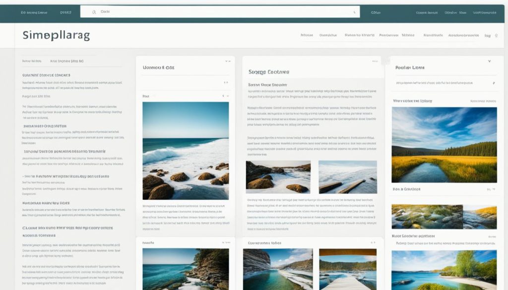
Making your blog look good is key to grabbing your readers’ attention and meeting your marketing goals. The first step is picking a website template or theme that fits your brand and blog’s purpose.
Selecting an Appropriate Template or Theme
Your chosen template must balance looks with ease of use. Pick a design that looks great and is easy to get around in. Think about the whitespace too. Having enough space makes your blog look classy and easy to read.
Prioritizing Whitespace and Typography
- Use lots of whitespace to make your blog clean and simple. This puts your content in the spotlight and makes it easier on the eyes.
- Choose typography that looks good and is easy to read. Go for fonts made for the web that are clear, and use them consistently across your blog.
- Try out different font sizes, weights, and spacing to make your text flow well and look good together.
By focusing on a great template and smart use of whitespace and typography, you can make a blog that draws in readers and offers a great reading experience.
Optimizing Navigation and User-Friendliness
Creating an easy-to-use blog navigation is key for a better user experience. A well-organized blog navigation helps your readers find what they need and boosts their interaction with your brand. Make sure your navigation bar is in a good spot and easy to follow to help visitors move through your blog smoothly.
Effective Navigation Bar and Social Media Integration
Your navigation bar should be easy to read, short, and look good. Put your content into clear sections so readers can quickly find what they want. Also, add social media links so people can easily share your posts and connect with you online. This can greatly improve your user experience and make your blog more visible on social media.
- Organize your navigation bar with clear, intuitive categories
- Strategically place social media buttons for easy sharing
- Ensure your navigation is mobile-friendly and responsive
- Regularly review and update your navigation based on user feedback

By focusing on a good blog navigation and adding social media links, you make your blog easy to use. This encourages your readers to check out more of your content and share it with others. This can lead to more engagement, a better user experience, and more people seeing your blog.
Incorporating Visuals and Multimedia
As a blogger, the visuals you use can greatly affect your site’s look and how engaging it is. Using relevant images, informative infographics, and captivating videos can make your content more interesting. These elements help break up text, keep readers interested, and make your message more appealing.
Relevant Images, Videos, and Infographics
Choosing the right visual content is key. It should match your writing and your site’s style. Good images enhance your text, highlight important points, and add beauty to your pages. Videos can also engage your audience and share information in a lively way.
Infographics are great for showing complex info in a visually appealing way. They make it easy for readers to understand important facts and statistics. This adds visual interest to your blog.
- Make sure all visuals are high-quality, relevant, and fit your blog’s design.
- Use alt text for images to help users and search engines understand them.
- Add captions and credits to give context and credit for your visuals.
By carefully adding visual content, images, videos, and infographics to your blog, you can make it more engaging and visually appealing. This approach helps reinforce your content and makes your blog stand out online.
Maintaining Consistent Branding
Branding is the core of your blog’s look. Keeping design consistency helps strengthen your brand. It makes your blog look professional and connected to your audience. Key to this is using fonts, colors, and design elements consistently.
Cohesive Use of Fonts, Colors, and Design Elements
Choosing the right typography is key. Pick a few fonts that work well together and use them everywhere. This makes your blog look good and easy to recognize.
Color schemes are also crucial for branding. Pick a main color set that fits your brand’s vibe. Use these colors for your blog’s design, like the background, headers, and buttons. This makes your blog look better and strengthens your brand.
- Set a consistent font pairing that shows your brand’s character
- Use a cohesive color palette all over your blog
- Add design elements like logos and icons to support your brand
With design consistency, your blog will look polished and professional. It will connect better with your audience and make your brand stronger. Being consistent is essential for good branding.

Blog design tips
Design is key to a successful blog. It draws in and keeps your audience interested. From catchy titles to eye-catching elements, there are many best practices for a great blog layout. Let’s look at some top tips to boost your blog’s look and feel.
Crafting Captivating Blog Post Titles
Your blog post title grabs the reader’s attention first. Make it catchy and informative. Aim for titles that make readers curious, highlight the content’s value, and promise an engaging read.
Prioritizing Visuals and Multimedia
Visuals are crucial in blog design. Use high-quality images, infographics, and videos to enhance your content. These elements make your blog more engaging and improve readability by breaking up the text.
Structuring Content for Easy Skimming
Today’s readers often scan content first. Make your blog posts easy to scan. Use clear headings, short paragraphs, and bullet points or numbered lists to help readers quickly understand your content.
Crafting Long-Form, Value-Packed Content
While concise content is important, don’t overlook in-depth, informative posts. Use your expertise to create long-form content that explores your niche deeply. Offer practical insights or solutions to your readers.
Implementing Compelling Calls-to-Action
Encourage action with well-placed calls-to-action (CTAs) in your blog posts. These could be to subscribe to your newsletter, download a free resource, or interact with your content in a certain way.
Using these blog design tips, you can make your blog visually appealing and easy to use. This will attract readers and keep them coming back for more.
Enhancing SEO and Search Visibility
Writing a great blog is just the start. To really boost your online presence, add search engine optimization (SEO) to your blog design. SEO helps your content get to the right people and rank high in search results.
Meta Tags, Keywords, and On-Page Optimization
Improving your blog’s SEO means making your on-page content better. Use the right keywords and meta tags to help search engines understand your blog posts better.
- Do deep keyword research to find what your audience is looking for.
- Put these keywords in your titles, headings, and text.
- Make your meta tags, like the title tag and meta description, clear and helpful summaries of your blog.
- Make sure your blog’s URL and file names are SEO-friendly and match your content.
By focusing on these SEO elements, you can make your blog more visible in search results. This means more people are likely to find and engage with your content. Keeping up with SEO best practices will help you stay ahead and keep a strong online presence.
Combining good design with strong SEO is key to a blog that grabs readers and ranks well in search engines. Mastering these methods can help your blog reach more people and grow your online audience.
To boost your blog’s SEO and search visibility, try more tips like getting high-quality backlinks, improving your site’s tech, and always tweaking your SEO strategies.
Inspiring Blog Design Examples
There are many inspiring blog designs to look at when you want to make your blog look good and easy to use. Bella and Bloom has a vibrant and modern look. Mom Boss Life has a chic and minimalist style that stands out.
Style Stories and All the Food have clean designs that focus on easy reading and organizing content well. Adobe by Estie and The Ultimate Photographer use bold images to grab attention.
The Wine Tails, britdotdesign, and Life As We Explore have creative and fun designs. They mix visuals, stories, and functionality in a unique way. Urban Roots has a clean, professional look that makes its content stand out.
These blogs show the many ways you can make your own blog look great and work well. By looking at these examples, you can learn how to make your blog visually appealing and engaging. This will help you attract more readers and get better results.
Implementing Data-Driven Visuals
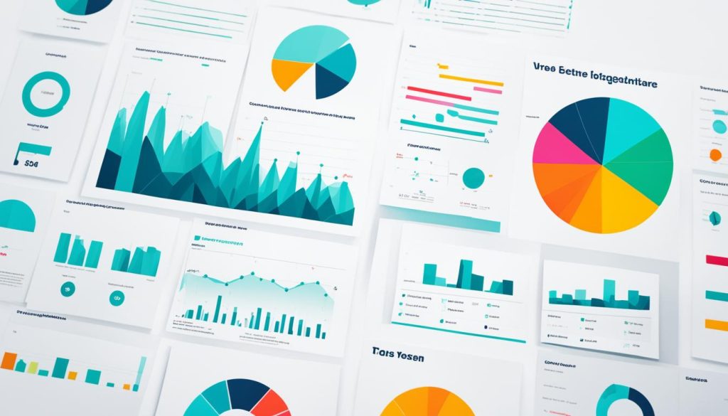
To become a leader in your field, add data-driven visuals to your blog. Articles with charts, graphs, and solid research get shared more and get more links. Using visuals makes your points clear and easier to remember.
Charts and Graphs
Tools like charts and graphs are great for showing your research. Charts are good for numbers, trends, and comparisons. Graphs show relationships and patterns well. These visuals turn hard info into something easy to see and like.
Research-Based Content
Adding research-based content to your blog makes your writing more credible. It can be from industry studies, expert views, or your own research. This shows you know your stuff and gives readers useful info.
| Metric | Blog Posts with Data Visuals | Blog Posts without Data Visuals |
|---|---|---|
| Shares | 321 | 129 |
| Backlinks | 87 | 42 |
| Engagement Time | 4 min 12 sec | 2 min 48 sec |
Using data visualization, charts, graphs, and research-based content makes your blog informative and educational. It also shows you’re an expert in your field.

Leveraging the Power of Quotes
Using quotes from industry influencers or experts can make your blog more interesting and credible. An image with a quote can make your content stick in people’s minds and spread further through influencer marketing.
Quotes from famous people can boost your blog’s authority and expertise. This makes you look like a leader in your field. It also uses the trust people have in the quoted influencer.
- Pick quotes that match your brand and speak to your audience.
- Make visually appealing graphics for the quotes that fit your blog’s style.
- Share the quote-based visual content on your social media to get more engagement and reach.
Quotes from influential people can make your blog look better and more credible. They can also help you reach new people through the influencers’ networks.
| Influencer | Quote | Relevance |
|---|---|---|
| Neil Patel | “Content is the fuel that powers the digital marketing engine.” | Shows how important high-quality, engaging content is in today’s marketing. |
| Rand Fishkin | “The best SEO is often simply creating remarkable content.” | Points out the role of visual content and quotes in boosting search engine rankings. |
| Ann Handley | “The best marketing doesn’t feel like marketing.” | Stresses the importance of a real, genuine approach to influencer marketing and content. |
Creating Compelling Infographics
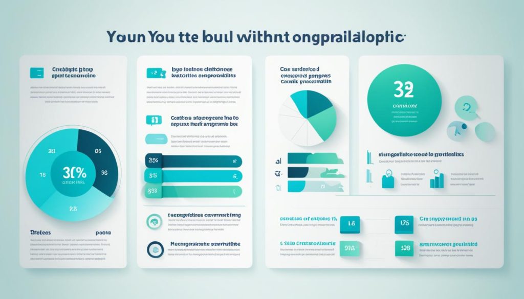
As a blogger, you can grab your audience’s attention with infographics. These are a powerful way to share information through visual content. They can bring more traffic, links, and shares to your blog. By mixing research, data, and good design, you can make infographics that teach and interest your readers.
Infographics make complex info easy to understand and share. They turn complicated data into something simple. When done well, they become tools for data visualization. They show off your knowledge and add value to your readers.
Key Elements of Effective Infographics
- Clear and concise messaging that aligns with your content goals
- Visually appealing design with a cohesive color scheme and typography
- Relevant and accurate data presented in an easy-to-digest format
- Compelling visuals, such as icons, illustrations, or charts, to enhance the information
- Optimized for sharing across social media platforms and the web
Designing Infographics that Stand Out
To make infographics that grab attention, start by picking the main message you want to share. Look for the right data and arrange it in a way that tells a story. Keep the design simple, clean, and focused on the key points.
| Infographic Elements | Best Practices |
|---|---|
| Title and Introduction | Create a clear, attention-grabbing title and a concise introduction that sets the stage for the content. |
| Data Visualization | Use appropriate charts, graphs, or illustrations to present data in an engaging and easy-to-understand format. |
| Iconography and Imagery | Incorporate relevant icons, illustrations, or photographs to enhance the visual appeal and reinforce the message. |
| Layout and Design | Maintain a clean, organized layout with ample whitespace to ensure readability and flow. |
By making infographics that look great and are full of useful info, you can make your blog better. Use the power of visual content and data visualization to connect with and teach your readers.

Utilizing Gifographics and GIFs
In the world of digital marketing, gifographics and animated visuals are key to grabbing your audience’s attention. They mix the info of infographics with the fun of GIFs. This makes your blog content more engaging and exciting.
Gifographics blend static and moving parts to explain complex ideas in an engaging way. They can make your content more popular on social media than regular infographics. With animations and transitions, your content becomes more memorable and easy to share.
Adding GIFs to your blog gives your brand a personal touch. These short animations can show different feelings and help make your content more relatable. They can highlight a point, add humor, or just make your blog more fun.
Using gifographics and animated visuals can make your blog stand out. They make your design and content more appealing and increase sharing. Try these formats to mix info with fun, and see your blog’s impact grow.
Incorporating Memes and Humor
Add some fun and visual appeal to your blog! Using memes and humor can make your content more engaging and relatable. These visuals grab attention, spark emotions, and stick with your readers.
Memes are a fun way to share laughs online. By adding the right memes to your blog, you show off your fun side. This visual content breaks up the text, making your blog easier and more fun to read.
Humor can help you connect with your readers on a deeper level. The right memes and jokes can make your brand stand out. They show your unique voice and make your content feel more human. But remember, don’t overdo it to keep your blog professional.
- Find memes that fit your brand’s style and tone.
- Use humor to support your main message, not distract from it.
- Make sure your visual content looks great and fits well in your blog.
- Watch how your readers react to see if your meme and humor work well.
Adding memes and humor can make your blog stand out. It creates a memorable and engaging experience for your readers. So, get ready to add some visual content magic to your blog strategy!

Enhancing Content with Videos
Videos are a powerful tool in blog content. They can share a webinar, show a product, or explain something simply. Adding videos to your posts makes the info easier to get and more fun to watch. Videos bring your blog to life with video content, making it more engaging and attractive.
Videos grab your audience’s attention and make complex ideas fun and easy to understand. By adding videos to your blog, you make the experience better for readers. This can lead to more time spent on your page and better content performance.
Here are some tips for using videos in your blog:
- Make sure your video fits the blog’s topic and purpose.
- Use keywords, descriptions, and tags to help search engines find your videos.
- Make your videos look good and professional to match your blog’s quality.
- Use platforms like YouTube or Vimeo to share your videos easily.
- Ask viewers to interact with your videos by leaving comments or sharing their thoughts.
Using video content can make your blog stand out. It offers visually engaging experiences that grab your audience’s attention.
| Video Type | Benefits | Best Practices |
|---|---|---|
| Recorded Webinar | Provides in-depth expertise, increases authority | Optimize for search, include engaging visuals |
| Product Demo | Showcases features, enhances understanding | Keep videos concise, focus on key highlights |
| Explainer Video | Simplifies complex topics, improves accessibility | Use a clear, conversational tone, add captions |
Using Screenshots Effectively
Adding screenshots to your blog posts can boost user engagement. It makes your content clearer and easier to understand. Screenshots let you share important visuals with your readers easily.
They’re great for showing off new software features, guiding through tutorials, or pointing out website elements. Screenshots make your posts more informative and simple to follow. This creates a better experience for your readers.
Capturing High-Quality Screenshots
Taking screenshots is easy, no matter the device you’re on. You can use free tools on Windows, Mac, smartphones, and Chromebooks to get clear, high-quality images.
- For Windows, use the built-in Snipping Tool or the Print Screen function.
- On a Mac, use the Shift+Command+3 or Shift+Command+4 keyboard shortcuts.
- On Chromebooks, you can press Ctrl+Show Windows to take a screenshot.
- Smartphone users can typically take screenshots by pressing the Power and Volume buttons simultaneously.
After taking your screenshots, you can edit them with image editing tools. This lets you highlight parts or add captions and arrows.
By adding screenshots to your blog posts, you make your guides more engaging. This improves the user experience and makes your content better overall.
Integrating SlideShare Presentations
Making your blog look better can be easy by adding SlideShare presentations. SlideShare is known for its eye-catching presentations. It’s a great way to add slides that make hard topics easy to understand. This can make your blog more engaging for readers.
SlideShare lets you make presentations that match your blog’s style. This keeps your blog looking consistent. You can share things like industry news, lessons, or new ideas. SlideShare makes your blog look better and keeps readers interested.
Adding SlideShare decks to your blog posts makes reading fun and interesting. It mixes text and visuals well. Using presentations in your blog helps you share complex ideas clearly. It shows you know your stuff and makes a strong impression on readers.

