Blog Graphic Design Basics
Blogging is a complicated thing, but thanks to my articles on blogging basics, I cover all the aspects of it, including blog graphic design basics.
Blog graphic design basics encompass the strategic use of images, typography, and layout to enhance visual appeal, readability, and user engagement, while ensuring consistency with the blog’s overall branding and content messaging.
Blog Graphic Design Basics
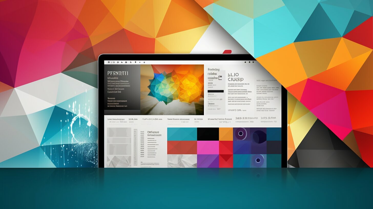
Welcome to my latest post on Blog Graphic Design Basics. In this article, I will provide you with essential knowledge and tips to enhance your blog’s visual appeal through graphic design. Whether you are a beginner or looking to improve your skills, understanding the basics of graphic design is crucial for creating eye-catching blog graphics. From utilizing space effectively and mastering balance and alignment to harnessing the power of contrast and observing hierarchy, we will explore all the fundamental techniques and concepts you need to know. Let’s dive in and discover the world of graphic design for blogs!
Understanding Graphic Design and Its Types
To grasp the foundations of blog graphic design, it’s essential to have a clear understanding of graphic design as a whole and the various types it encompasses. Graphic design is the practice of arranging visual elements to convey or enhance a message. It plays a crucial role in creating visually appealing designs for different purposes, whether it’s branding, marketing, web design, illustration, typography, infographics, textiles, packaging, or motion.
Each type of design requires different skills and techniques to effectively communicate and engage the audience. Brand design focuses on creating a cohesive visual identity for a business or product, while marketing design is geared toward promotional materials and advertisements. Web design aims to create user-friendly and visually appealing websites, and illustration design brings concepts and ideas to life through visuals.
Typography design focuses on the art of arranging typefaces, whereas infographic design simplifies complex information into visually engaging graphics. Textile and surface design incorporate patterns and textures for fabric and other surfaces, while packaging design aims to create attractive and functional packaging solutions. Lastly, motion design combines graphic design with animation to create visually dynamic and engaging content.
Understanding the different types of graphic design is essential for bloggers who want to create visually appealing and effective blog graphics. By having knowledge of these design disciplines, bloggers can apply the relevant skills and techniques to create graphics that enhance their overall blog design and engage their audience.
| Type of Design | Description |
|---|---|
| Brand Design | Creating a cohesive visual identity for a business or product. |
| Marketing Design | Designing promotional materials and advertisements. |
| Web Design | Creating user-friendly and visually appealing websites. |
| Illustration Design | Bringing concepts and ideas to life through visuals. |
| Typography Design | Arranging typefaces to create visually pleasing text. |
| Infographic Design | Simplifying complex information into visually engaging graphics. |
| Textile and Surface Design | Creating patterns and textures for fabric and other surfaces. |
| Packaging Design | Designing attractive and functional packaging solutions. |
| Motion Design | Combining graphic design with animation for dynamic content. |
Utilizing Space Effectively
Properly utilizing space is key to creating visually appealing and balanced blog graphics. Space in design refers to the areas around and within elements of a design. It includes both positive space, which is the space occupied by the main elements, and negative space, which is the empty or white space surrounding and between those elements.
White space, also known as negative space, is a powerful tool in graphic design. It allows the viewer’s eyes to rest and helps create a sense of balance and harmony. By strategically using white space, you can guide the viewer’s attention and create a clean and uncluttered look for your blog graphics.
When utilizing space in your blog graphics, consider the overall composition and the relationship between elements. Experiment with different spacing options to find the right balance of positive and negative space. Remember that too much clutter can make your design overwhelming, while too much white space can make it feel empty. Striking the right balance will ensure that your blog graphics are visually appealing and easy to read.
| Space in Design | Key Points |
|---|---|
| Positive Space | The space occupied by the main elements in a design. |
| Negative Space | The empty or white space surrounding and between elements. |
| White Space | Also known as negative space, it allows for balance and harmony, guiding the viewer’s attention. |
| Balance | Finding the right amount of positive and negative space to create a visually appealing and uncluttered design. |
By understanding the importance of utilizing space effectively and experimenting with different spacing options, you can elevate the visual appeal and readability of your blog graphics. So, embrace the power of space and create designs that captivate your readers.
Mastering Balance and Alignment
Balance and alignment play a crucial role in creating visually pleasing and professional blog graphics. Achieving balance in design ensures that elements are organized in a harmonious way, creating a sense of stability and order. There are two main types of balance in graphic design: symmetrical balance and asymmetrical balance.
Symmetrical Balance
Symmetrical balance refers to the arrangement of elements in a design that are evenly distributed around a central axis. This creates a sense of equilibrium and order. It is commonly used to convey a sense of formality, elegance, and stability in blog graphics. For example, a blog header with symmetrical balance would have text and graphics centered perfectly on the page, creating a visually pleasing and balanced composition.
Asymmetrical Balance
Asymmetrical balance, on the other hand, involves creating balance by arranging elements that are different in size, color, or weight. It relies on visual tension and contrast to create a visually interesting composition. Asymmetrical balance is often used to convey a sense of movement, dynamism, and creativity. For instance, a blog post layout with a larger image on one side and text on the other, creating an asymmetrical balance, can grab the reader’s attention and add a sense of visual interest to the design.
Understanding and applying balance and alignment principles in your blog graphics will elevate the overall visual appeal and professionalism of your designs. By achieving a sense of balance and harmony, you can effectively communicate your message and create visually impactful graphics that captivate your audience.
| Type of Balance | Description | Example |
|---|---|---|
| Symmetrical Balance | The arrangement of elements that are evenly distributed around a central axis. | A blog header with centered text and graphics. |
| Asymmetrical Balance | The arrangement of elements that are different in size, color, or weight. | A blog post layout with a larger image on one side and text on the other. |
The Power of Contrast
Discover the art of using contrast to create visually striking blog graphics. Contrast is a powerful tool in graphic design that can elevate the impact of your designs and grab your readers’ attention. By strategically incorporating contrast techniques, you can make your blog graphics visually appealing and engaging.
Color contrast is one of the most effective ways to create visual interest. By combining colors that are opposites on the color wheel, such as black and white, or complementary colors like blue and orange, you can create a high-contrast design that immediately catches the eye. On the other hand, using colors that are similar in shade or tone creates a low-contrast design that can evoke a more subtle and calming visual effect.
Contrast Techniques
There are several contrast techniques you can employ to enhance the impact of your blog graphics. One technique is using contrast in size and scale. By juxtaposing elements of different sizes, you can create a sense of hierarchy and visual interest. For example, pairing a large heading with smaller subheadings or incorporating large, bold graphics with smaller text can create a dynamic visual composition.
Another technique is contrast in texture. By combining smooth and rough textures, or glossy and matte surfaces, you can add depth and dimension to your designs. Textures can create visual interest and make your graphics more tactile and visually appealing.
Utilizing contrast effectively in your blog graphics can have a significant impact on the overall aesthetic and readability of your content. Whether it’s through color, size, or texture, incorporating contrast will help your designs stand out and captivate your readers.
Contrast Techniques
| Contrast Technique | Description |
|---|---|
| Color Contrast | Combining colors that are opposites or complementary on the color wheel to create visual impact. |
| Size and Scale Contrast | Juxtaposing elements of different sizes to create hierarchy and visual interest. |
| Texture Contrast | Combining different textures, such as smooth and rough, to add depth and dimension to designs. |
Observing Hierarchy
Learn how to create a hierarchy in your blog graphics to guide your readers’ attention. Hierarchy in design refers to the arrangement of elements in a way that communicates their importance and guides the viewer’s eye. By establishing a clear and intuitive visual hierarchy, you can ensure that your audience easily grasps the main message of your blog graphics.
One of the key techniques to achieve hierarchy is through size variation. By using larger elements, such as headings or prominent images, you can instantly draw attention to them and communicate their significance. Smaller elements, on the other hand, can be used to provide supporting information or secondary details. This contrast in size helps create a clear focal point and enhances the overall visual appeal of your design.
Techniques for creating a hierarchy
- Color contrast: Utilize contrasting colors to make certain elements stand out. Bright or saturated colors tend to attract attention, while muted or neutral colors recede into the background.
- Typography: Vary the font styles, sizes, and weights to signify different levels of importance. Bold or italicized text can be used for headings or key points, while regular text can be used for supporting information.
- Visual elements: Employ arrows, lines, or other graphical elements to guide the viewer’s eye. These elements can help establish a logical flow and direct attention towards the most important elements in your design.
Remember, the hierarchy of information is not just about making elements bigger or adding more visual weight. It’s about creating a visual structure that guides your readers’ attention and ensures that the most important information stands out. By mastering the art of hierarchy, you can create blog graphics that effectively communicate your message and engage your audience.
| Key Techniques | Examples |
|---|---|
| Size variation | Using a larger headline for the main message and smaller text for supporting details. |
| Color contrast | Use a larger headline for the main message and smaller text for supporting details. |
| Typography variation | Using different font styles, sizes, and weights to signify importance and hierarchy. |
| Visual elements | Incorporating arrows or lines to guide the viewer’s eye and create a logical flow. |
Shape and Color Psychology
Explore the fascinating world of shape and color psychology in blog graphic design. The shapes and colors you choose have a significant impact on the emotional response and perception of your blog graphics. Understanding the psychology behind these elements will allow you to create visually appealing designs that evoke the desired emotions from your audience.
Shapes communicate meaning and can influence how viewers interpret your message. For example, circles often convey a sense of unity or community, while squares and rectangles suggest stability or order. By strategically utilizing shapes in your blog graphics, you can enhance the overall impact and convey specific messages to your readers.
Color is another powerful tool in graphic design, with each hue carrying its own symbolic meaning. Warm colors like red and orange are often associated with energy and passion, while cool colors like blue and green evoke a sense of calmness or tranquility. Understanding color symbolism and how different color schemes interact will enable you to create visually appealing blog graphics that effectively communicate your message.
| Color | Symbolic Meaning |
|---|---|
| Red | Energy, passion, excitement |
| Blue | Calmness, trust, reliability |
| Green | Nature, growth, harmony |
| Yellow | Optimism, happiness, creativity |
As you dive deeper into the world of shape and color psychology, experiment with different combinations and observe how they influence the overall mood and perception of your blog graphics. By harnessing the power of shapes and colors, you can create designs that captivate your readers and effectively convey your message.
The Art of Typography
Dive into the world of typography and discover how it enhances your blog graphics. Typography, the art of arranging type, plays a crucial role in creating visually appealing and reader-friendly designs. With the right font selection, typography hierarchy, and considerations for readability, you can elevate the impact of your blog graphics.
Selecting the right fonts is essential for conveying the right tone and personality. Whether you want to evoke elegance or playfulness, the choice of font can greatly influence the overall message. Consider the readability of the font, ensuring that it is clear and legible across different devices and sizes.
Typography hierarchy refers to the organization of type elements to create a clear visual structure. Headings, subheadings, and body text should all have a distinct hierarchy, guiding the reader’s attention and emphasizing the most important information. By using different font sizes, weights, and styles, you can establish a hierarchy that enhances the readability and visual appeal of your blog graphics.
| Typography Hierarchy | Example |
|---|---|
| H1 (Main Heading) | The Art of Typography |
| H2 (Subheading) | The Power of Fonts |
| H3 (Subheading) | Choosing the Right Font |
| Paragraph (Body Text) | Typography plays a crucial role… |
Font pairing is another important aspect of typography. By combining different fonts that complement each other, you can create visual interest and add depth to your blog graphics. Experiment with contrasting fonts, such as pairing a serif font with a sans-serif font, or choose fonts from the same family to maintain consistency.
Incorporating effective typography into your blog graphics will enhance the overall visual appeal and readability, creating a memorable experience for your readers. So, take your designs to the next level by exploring the world of typography and unleashing its power in your blog graphics.
Adding Depth with Texture
Learn how to add depth and visual interest to your blog graphics by incorporating texture. Texture is a powerful element in graphic design that can elevate your designs and make them more engaging and memorable. By strategically using different texture techniques, such as visual texture and tactile texture, you can create designs that not only look great on the screen but also provide a unique sensory experience for your audience.
Visual texture refers to the illusion of texture created by visual elements in your design. It can be achieved through the use of patterns, gradients, or images that mimic the texture of real-world objects. Incorporating visual texture can add richness and depth to your blog graphics, making them visually appealing and dynamic.
On the other hand, tactile texture involves incorporating actual physical textures in your design, such as paper textures or fabric textures. This can be done through the use of texture overlays or by scanning and digitally manipulating physical textures. Adding tactile texture not only enhances the visual impact of your blog graphics but also creates a more immersive experience for your audience.
| Benefits of Texture in Graphic Design | Examples |
|---|---|
| Enhances visual appeal of blog graphics | Using textures to create a grungy background for a music blog |
| Adds depth and dimension to designs | Incorporating a wood grain texture in a product mockup for a furniture blog |
| Creates a tactile and sensory experience | Using a fabric texture to simulate the feel of textiles in a fashion blog post |
So, whether you want to add a touch of realism to your illustrations, create a textured background for your blog posts, or simulate physical materials in your designs, texture is an essential tool in your graphic design arsenal. Experiment with different texture techniques and have fun exploring the endless possibilities that texture can bring to your blog graphics.
Achieving Consistency and Balance in Layout
Discover the key elements of layout design that contribute to a balanced and consistent visual identity for your blog.
Consistency is crucial in creating a cohesive and professional look for your blog graphics. By maintaining a consistent layout, you ensure that your readers can easily navigate through your content and understand your message. Consistent elements such as font choices, color schemes, and spacing help establish a strong visual identity that reflects your brand’s personality.
Rhythm plays a vital role in guiding the viewer’s eye across your blog graphics. By strategically arranging elements such as text, images, and graphics, you create a sense of flow and movement that keeps your audience engaged. Consider using repetition, progression, or alternation to create a rhythm that adds visual interest and captures attention.
Proximity is another essential aspect of layout design that influences how your audience perceives and understands your content. By grouping related elements together and placing them in close proximity, you create visual relationships and convey hierarchy. This helps your readers quickly grasp the organization and structure of your blog graphics, enhancing their overall experience.


Przemo Bania is a blogger and writer whose love of blogging began as an impulse, not as a hobby but a necessity, seeing his wife struggle with endometriosis. Przemo runs two other blogs which you can find by reading his story…