Seasonal color schemes for pins play a crucial role in enhancing Pinterest visuals and attracting more engagement year-round. In the world of pin design, choosing the right color palette is essential to convey the desired message and evoke the right emotions in viewers. Whether it’s a spring campaign with vibrant greens and corals, a summer campaign with cool and muted tones, an autumn campaign with warm and earthy hues, or a winter campaign with strong cool hues, each season brings its own unique color palette that can captivate audiences.
When it comes to pins, color is more than just a visual element. It has the power to evoke specific emotions, tie in with the seasons and holidays, and align with current color trends. By incorporating seasonal color schemes into pin designs, brands can create a visual language that resonates with their target audience and enhances their overall branding and marketing efforts.
Aligning the color palettes with the brand’s identity is crucial for maintaining consistency and cohesiveness. Each pin should reflect the brand’s message and values, while also capturing the essence of the season. Designers can play a pivotal role in selecting and implementing the right color schemes that not only align with the brand, but also create visually appealing pins that leave a lasting impression.
However, it is important to ensure color consistency across different mediums. Colors may appear differently on screen compared to when they are printed. To avoid any discrepancies, it is recommended to request printed proofs to ensure that the colors in pin designs match both on screen and in print. This attention to detail can make all the difference in delivering a cohesive and impactful visual experience to the audience.
So, whether you’re planning a spring, summer, autumn, or winter campaign, consider the power of seasonal color schemes for your pins. By incorporating the right color palettes and aligning them with your brand’s identity, you can create visually stunning pins that effectively communicate your message and captivate your audience.
Importance of Seasonal Color Schemes
Utilizing appropriate seasonal color schemes in pin designs is essential for capturing the attention of your audience and conveying the right message. The colors you choose can evoke specific emotions, align with current color trends, and create a sense of connection with the seasons and holidays. By incorporating seasonal colors into your pin designs, you can enhance your branding and marketing efforts, making them more memorable and effective.
Each season has its own unique color palette that can be used to create visually appealing pins. For a spring campaign, consider using vibrant greens, corals, rose reds, bright teals, and yellows. These colors evoke feelings of freshness and growth, which are often associated with the season. In contrast, a summer campaign can benefit from cool and muted tones like grays, dusty pinks, watery blues, and greens, which reflect the relaxed and laid-back atmosphere of summer.
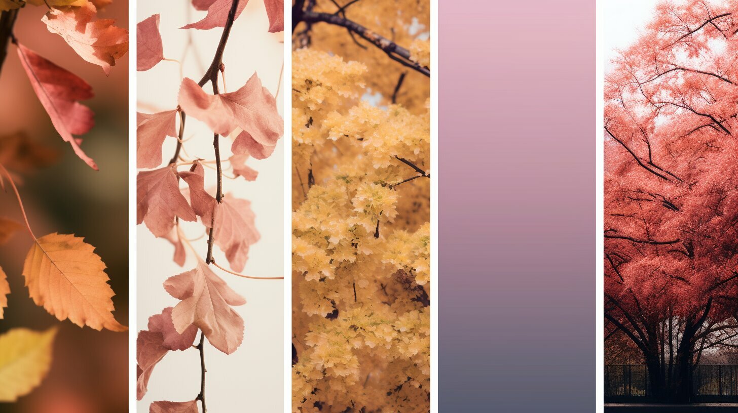
When transitioning into autumn, warm and earthy tones like oranges, reds, and golden yellows can create a cozy and inviting atmosphere in your pin designs. These colors are reminiscent of falling leaves and the harvest season. Finally, for a winter campaign, consider using strong cool hues like highly saturated reds, blues, greens, purples, and yellows to evoke a sense of winter magic. These colors can create a festive ambiance and align with the holiday season.
Aligning your color palettes with your brand identity is crucial. The colors you choose should not only reflect the season but also resonate with your brand’s message and values. Working with professional designers can help ensure that your pin designs are cohesive and consistent with your overall branding and marketing materials. Additionally, it is recommended to request printed proofs to ensure that the colors in your pin designs match both on screen and in print. This attention to detail will further enhance the impact of your seasonal color schemes and strengthen your brand’s visual presence.
Spring Color Palettes
Embrace the freshness of spring with pin designs that incorporate lively color palettes, featuring vibrant greens, corals, rose reds, bright teals, and sunny yellows. These colors are reminiscent of blooming flowers, chirping birds, and the overall rejuvenation that comes with the season. By using these vibrant hues in your pin designs, you can create visually appealing content that captures the essence of spring.
When it comes to spring color schemes, the possibilities are endless. You can opt for a monochromatic look by focusing on different shades of green, creating a harmonious and serene feel. Or you can go for a contrasting combination of coral and teal to evoke a sense of energy and excitement. Mixing in pops of rose red and sunny yellow can add warmth and vibrancy to your pins.
Spring color palettes also provide an excellent opportunity to tie in with seasonal trends and holidays. For example, pastel shades like mint greens and soft pinks can be used to create pins that feel fresh and Easter-inspired. By strategically incorporating these seasonal colors into your pin designs, you can attract attention, evoke positive emotions, and engage your audience in a meaningful way.
To create visually appealing pins that resonate with your target audience, consider seeking professional design assistance. Designers have the expertise to select and integrate seasonal colors into your branding and marketing materials, ensuring that your pins stand out and align with your brand’s identity and message. Additionally, it is recommended to request printed proofs to ensure that the colors in your pin designs remain consistent across different mediums, both on screen and in print.
Summer Color Palettes
Transport your audience to sun-soaked days with captivating pin designs that utilize cool and muted tones such as grays, dusty pinks, watery blues, and soothing greens, perfect for the summer season. These colors evoke a sense of tranquility and relaxation, capturing the essence of warm summer days and cool breezy nights.
When creating pin designs for a summer campaign, consider using a combination of these colors to create a visually appealing and cohesive aesthetic. Pairing shades of gray with dusty pinks can create a soft and romantic feel, reminiscent of a dreamy summer sunset. Adding watery blues and greens can evoke a sense of calmness and serenity, like the gentle lapping of waves on a sandy beach.
To enhance the impact of these colors, consider incorporating natural elements such as seashells, palm trees, or beach landscapes into your pin designs. This will further transport your audience to the blissful atmosphere of summer, while also reinforcing your branding and marketing efforts.
Key Points:
- Utilize cool and muted tones like grays, dusty pinks, watery blues, and soothing greens for summer pin designs.
- Create a visually appealing and cohesive aesthetic by combining these colors.
- Incorporate natural elements into your pin designs to enhance the summer atmosphere.
Autumn Color Palettes
Capture the enchanting spirit of autumn with pin designs that incorporate warm and earthy tones such as oranges, reds, and golden yellows, reminiscent of the fall foliage. These colors evoke a cozy and inviting atmosphere, perfect for creating pins that resonate with the season.
Here are some Pinterest color palettes and pin design inspiration ideas for incorporating autumn colors into your pin designs:
- Harvest Hues: Use shades of burnt orange, deep red, and golden yellow to create a palette that reflects the colors of autumn leaves.
- Rustic Warmth: Combine rich browns, muted oranges, and warm yellows to evoke a feeling of rustic charm and comfort.
- Woodland Whimsy: Experiment with deep greens, earthy browns, and pops of vibrant reds to capture the essence of a magical forest in the fall.
Creating Coherence with Brand Identity
When incorporating these autumn color palettes into your pin designs, it is essential to ensure they align with your brand identity. Consider how the colors complement your brand’s message and values, and use them consistently across your branding and marketing materials. This cohesiveness helps establish a visual identity that customers can easily recognize and associate with your brand.
Working with a professional designer can be invaluable in selecting and integrating seasonal colors into your pin designs. They can provide expert guidance and creativity to help you develop visually appealing pins that resonate with your target audience.
Lastly, to ensure color consistency, it is recommended to request printed proofs for your pin designs. This will allow you to see how the colors translate from screen to print, ensuring that the desired hues are accurately represented. Consistency in color is crucial in maintaining a strong brand image and delivering a seamless experience to your audience.
Winter Color Palettes
Embrace the winter wonderland vibe with pin designs that incorporate strong cool hues such as highly saturated reds, blues, greens, purples, and shimmering yellows, perfect for the winter season. These colors can evoke a sense of enchantment and magic, capturing the essence of the snowy landscapes and chilly weather.
When it comes to winter color palettes for pins, bold and vibrant hues work exceptionally well. Think of shades like deep crimson reds that mimic the warmth of a crackling fireplace, icy blues reminiscent of frozen lakes, and rich shades of green that mimic evergreen trees. Incorporating these colors into your pin designs can instantly transport your audience to a winter wonderland.
Consider the following winter color palettes for your pins:
- Deep Reds and Golds: These colors exude warmth and elegance, perfect for promoting holiday-themed products or services.
- Icy Blues and Silvers: These cool tones create a serene and tranquil atmosphere, ideal for promoting relaxation or winter-themed travel destinations.
- Evergreen Greens and Whites: These colors reflect a sense of freshness and renewal, perfect for promoting eco-friendly products or outdoor winter activities.
Remember, the key to successful pin design is to align the chosen color palette with your brand’s identity and message. Winter color palettes can be adapted to suit different industries and niches, so don’t be afraid to experiment and find the combination that resonates best with your target audience.
Lastly, to ensure color consistency across various mediums, it is recommended to request printed proofs of your pin designs. This step will help you ensure that the colors appear as intended on both screens and in print, guaranteeing a seamless and visually appealing experience for your audience.
Aligning Color Palettes with Brand Identity
Harmonize your pin designs with your brand identity by carefully selecting and integrating seasonal color schemes that align with your brand’s messaging and values. When it comes to pin design, colors play a crucial role in evoking emotions and creating a cohesive visual experience. By using seasonal color palettes, you can enhance the impact of your pins and make them more relatable to your target audience.
Start by understanding the seasonal colors that resonate with your brand and target market. Research color trends and explore color psychology to identify the hues that align with your brand’s message and values. For example, if you want to convey freshness and growth, vibrant greens and yellows can be perfect for a spring campaign. On the other hand, cool and muted tones like blues and grays can create a serene and relaxing atmosphere for a summer campaign.
Utilizing the Power of Seasonal Color Palettes
- Spring Color Palettes: Incorporate vibrant greens, corals, rose reds, bright teals, and yellows to capture the essence of the season and evoke a sense of renewal and energy.
- Summer Color Palettes: Opt for cool and muted tones like grays, dusty pinks, watery blues, and greens to create a relaxing and refreshing atmosphere that embodies the summer spirit.
- Autumn Color Palettes: Embrace warm and earthy tones like oranges, reds, and golden yellows to create a cozy and inviting atmosphere that reflects the beauty of autumn.
- Winter Color Palettes: Experiment with strong cool hues like highly saturated reds, blues, greens, purples, and yellows to evoke a magical and wintery feel in your pin designs.
Remember that consistency is key when using seasonal color schemes. Ensure that your pins align with your brand’s overall visual identity, including your logo, website, and other marketing materials. This will create a strong brand image and help your pins stand out in a crowded digital space.
Consider seeking professional design assistance to select and implement seasonal colors effectively. Professional designers have the expertise to translate your brand’s message into visually appealing pin designs that resonate with your target audience. Additionally, don’t forget to request printed proofs to ensure that the colors in your pin designs remain consistent across different mediums, both on screen and in print.
Seeking Professional Design Assistance
Ensure your pin designs shine by enlisting the expertise of professional designers who can help you select and integrate seasonal colors that perfectly align with your brand’s vision. Designing pins that stand out in a crowded digital landscape requires a keen eye for color and an understanding of how to use seasonal color schemes effectively. By partnering with experienced designers, you can tap into their knowledge and creativity to create visually stunning pins that capture the essence of each season.
Professional designers are well-versed in the latest design trends and have the skills to translate your brand’s messaging into visually appealing pin designs. They can help you navigate the wide array of seasonal color palettes, ensuring that the colors you choose evoke the desired emotions and resonate with your target audience. From vibrant greens and corals for a spring campaign to cool and muted tones for summer, and warm earthy hues for autumn to strong cool hues for winter, designers can guide you in selecting the right color schemes for your pins.
Collaborate for Cohesion
One of the key benefits of working with professional designers is their ability to help you align your pin designs with your brand’s identity. They have an eye for detail and can ensure that the colors you use in your pins reflect your brand values and create a cohesive brand experience. By collaborating closely with designers, you can develop pin designs that strengthen your brand image and help you stand out in the marketplace.
Moreover, professional designers can assist you in maintaining color consistency across different mediums. They can provide guidance on color matching and help you request printed proofs to ensure that the colors in your pin designs look the same on screen and in print. This attention to detail will ensure that your pins make a lasting impression, no matter where they are viewed.
Incorporating seasonal color schemes into your pin designs is a powerful way to elevate your branding and marketing efforts. By enlisting the expertise of professional designers, you can leverage their knowledge and creativity to create visually stunning pin designs that capture the essence of each season while aligning with your brand’s vision. Don’t underestimate the impact that thoughtful color selection can have on your pins. Embrace the power of seasonal color schemes and see how it enhances your brand’s visibility and engagement.
Ensuring Color Consistency
Guarantee the fidelity of your pin designs by requesting printed proofs to ensure the accurate representation of colors across various mediums, maintaining consistency throughout your branding and marketing materials.
When it comes to pin design, it is crucial to consider how colors will appear not only on screens but also in print. The colors you choose may look vibrant and eye-catching on a digital platform, but they might appear dull or skewed when printed. By requesting printed proofs, you can verify that the colors in your pin designs match both on screen and in print.
Printed proofs provide a tangible representation of your pin designs, allowing you to assess the accuracy of colors and make any necessary adjustments. This step is particularly important if you plan to distribute physical marketing materials such as brochures, flyers, or business cards. By ensuring color consistency, you can present a cohesive and professional image to your audience.
Additionally, printed proofs enable you to maintain consistency throughout your branding and marketing materials. When colors are accurately represented, your pins will align seamlessly with other visual elements such as your logo, website, and social media graphics. This consistency reinforces your brand identity and helps establish recognition and trust among your target audience.